
 By admin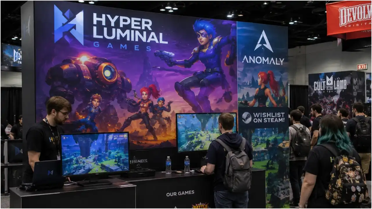
Why does interface art that looks perfectly sharp on a 27-inch monitor fall apart when it gets printed eight feet tall? That question turns up every show season, usually from a small studio that just opened its first booth proof and went quiet for a while. The honest answer is that a booth wall is a print job with its own physics, so a custom trade show booth new york attendees walk right up to has to be prepped for scale, proofed on the real material and produced with inks chosen for that surface, rather than exported from a design tool at screen size and sent off to a press. Five mistakes account for most of the damage, and every one of them is cheaper to fix six weeks out than six days out.
Screen Assets Are Not Print Assets
Design tools default to what a display needs: RGB color, 72 pixels per inch, a canvas measured in pixels instead of feet. A large format panel read from about six feet away wants somewhere near 100 to 150 dpi at final size, which for an eight-foot-wide graphic means an image in the neighborhood of 9,600 pixels across. A 1,920-pixel screenshot is nowhere close. The case we see most often is someone scaling that file up in the export dialog and assuming the software filled in the missing detail. It guessed instead.
A six-person studio sent over a hero image last spring for a New York games showcase, 1,920 pixels wide, pulled straight from its press kit. Printed at eight feet it read soft everywhere and blocky around the HUD text. The repair was a two-hour job inside the engine, re-rendering the same scene at four times the resolution, and it should have happened before anyone drew a layout.
Onscreen Brand Color Drifts Under Solvent Ink
A monitor makes color out of light and a printer makes it out of ink, and the two ranges do not overlap everywhere. Saturated purples, electric blues and neon greens sit outside what solvent and UV inks can reach on most substrates, so the brand purple that glows on a display comes back muted or shifted toward blue on a printed panel. (I have lost more arguments to a purple than to every other color combined, and the monitor is usually the one lying.) Fabric and rigid vinyl also take the same ink differently, so one file printed on two materials lands in two places. Ask for a printed draw-down on the actual substrate before the full run, and hand over brand colors as measured values rather than a screen grab, so the shop producing a custom trade show booth New York buyers will see under hall lighting has a target to match instead of a guess.
Compression Artifacts Grow With The Panel
JPEG compression is invisible at thumbnail size and merciless at wall size. Ringing around UI text, banding in gradients, noise around a health bar: all of it enlarges with the artwork, and no amount of sharpening puts back data the codec already threw away. Export lossless, capture at native resolution, and re-render rather than upscale wherever the engine allows it.
Deadline pressure is what pushes teams into that shortcut, and the shows themselves are not slipping. The in-person event cancellation rate dropped to 0.5% in the third quarter of 2025, down from 1.5% the quarter before, according to a December 2025 index report from CEIR and the International Association of Exhibitions and Events. Your show date is not moving. The file is the variable you actually control, so give it the weeks it needs.
Artwork Below Knee Height Goes Unread
Booth layouts eat the bottom of a wall. Counters, a literature stand, a demo station and a line of people standing in front of it will cover the first 30 to 36 inches, and nobody reads a logo behind somebody’s hip. Put the studio name, the release window and the platform icons between roughly 40 and 90 inches off the floor, where they clear both furniture and heads. The lower band still earns its space, just for texture and color rather than information. Aisle traffic approaches at an angle too, so a message centered on the wall arrives late, and the outer thirds carry more weight than a symmetrical layout suggests.
Proof Rounds Belong On The Calendar
Most artwork emergencies start life as schedule problems. Build the proof cycle into the production plan instead of hoping the first output is right. Week one is a file audit: resolution at final size, color mode, fonts, bleed, and whether the source art still exists anywhere other than a compressed export and week two is design refinement, where the layout gets adapted to the real panel dimensions and the hardware seams, because a seam through a character’s face is a note nobody wants to write twice. Week three is the material proof, a printed section on the substrate the finished wall will use, viewed under lighting close to what the hall runs. That proof settles the purple question, the artifact question and the legibility question at once, and it usually generates two or three small corrections rather than a rebuild. Week five is install, and by then the only open items should be logistics. Studios that run this sequence spend setup day placing furniture; the ones that skip it spend setup day apologizing to their art lead.
Treat The Wall As A Shipped Build
A booth graphic deserves the same discipline as a release candidate: asset audit, spec review, a test on the target hardware, then sign-off. Whatever sits in the file gets reproduced at forty times the size, in front of the press and publishers you traveled to meet. Treat the booth wall as a print deliverable with its own specs, proofs and approvals, and the eight-foot version will look like the version you designed. A few weeks of proofing costs far less than one show floor where the artwork undersells the game.